Home Color Psychology: Incorporating Hue Choices for Interior Design
In the realm of interior decor, the impact of colour on our psychological well-being should not be underestimated. Colours can significantly influence our mood, energy, and emotions, creating spaces that align with our lifestyles and preferences. Here, we delve into the psychological effects of various colours and offer guidance on choosing the perfect hue for your home.
Beginning with the neutral yet calming shade of beige, this colour promotes relaxation and comfort, making it an ideal choice for spaces where a warm, soothing atmosphere is desired without overwhelming stimulation.
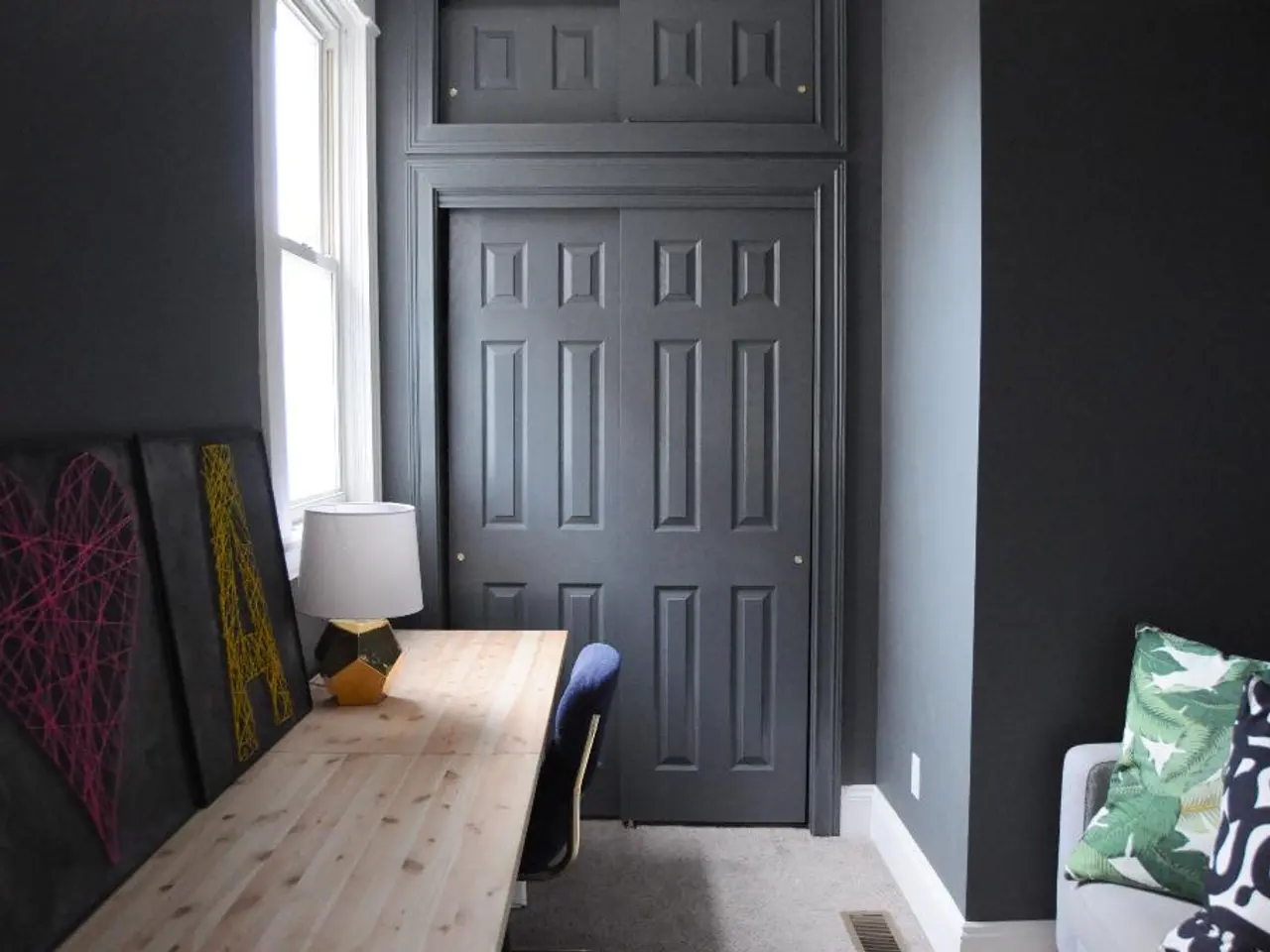
Gray, often associated with neutrality and balance, can create a sophisticated and modern look. Light grays can feel peaceful and calming, while darker grays might evoke a more serious or contemplative mood. However, it's crucial to balance gray tones with warmer elements to avoid a dull or depressive atmosphere.
Yellow, a bright and energetic colour, is often linked to happiness and optimism. While it can stimulate mental activity and creativity, it may cause feelings of anxiety or agitation if too intense or overused.
Blue, known for its calming and serene qualities, is a preferred choice for bedrooms and bathrooms as it promotes restful sleep and relaxation. It can lower heart rates and reduce tension, making blue an excellent option for spaces designed for relaxation.
Green, evoking nature, balance, and renewal, is soothing to the eyes and mind, promoting relaxation and comfort. It is versatile for various rooms, including living spaces and bedrooms, due to its calming effects.
Red, a very stimulating and intense colour, can increase energy, passion, and excitement. However, it may also provoke aggression, anxiety, or overstimulation if used excessively, so it is better used as an accent rather than a dominant wall colour.
Purple, often linked to creativity, luxury, and spirituality, can evoke very different feelings depending on the individual. Lighter shades tend to have a calming effect, while deeper purples can feel dramatic or opulent.
When choosing colours for your home, consider the purpose of each room and the mood you want to foster. For example, choose calming colours like blue or green for bedrooms, while energetic colours like yellow or red may be better for activity zones.
Reflect on your personal emotional response to colours since perception is subjective and varies culturally and individually. Think about how much natural light the room receives, as this affects how colours look and influence mood.
Use colour strategically to create zones or delineate spaces in open floor plans or multifunctional rooms. Balance bold colours with neutral ones to avoid overstimulation and create harmony. Experiment with texture and finishes alongside colour to add depth and enhance the psychological impact.
For those seeking inspiration and support in their colour selection journey, the SCHÖNER WOHNEN-Farbe Inspirationsbuch "Schoener Wohnen Begins with Color" offers a wealth of ideas and guidance. Priced at approximately 14.99 Euro, this comprehensive guide provides practical advice on choosing colours that align with your lifestyle and preferences.
For more information about SCHÖNER WOHNEN-Farbe, visit: [https://www.schoener-wohnen-farbe.com/](https://www.schoener-wohnen-farbe.com/). Additionally, SCHÖNER WOHNEN offers a range of trend colours, each with its unique psychological effects and price points. For instance, "Olive" costs 29.99 Euro, while "Ibiza" is priced at 34.99 Euro, and "Blueberry" and "Dreamy" are both 29.99 Euro. "Timeless Volcanic Gray", "Revitalizing Champagne Cream", and "Heartfelt Heart Red" each cost 39.99 Euro.
By applying colour intentionally in home design, we can deeply impact well-being by aligning spaces with the psychological effects of colours and our lifestyle and preferences.
Interior design plays a significant role in shaping our lifestyles and preferences, and colour selection is a crucial element in this process. The book "Schoener Wohnen Begins with Color" offers practical guidance on choosing colours that can align with your home-and-garden aesthetics and promote a positive lifestyle. For example, beige promotes relaxation and comfort, making it ideal for creating a soothing interior-design scheme in your home.


